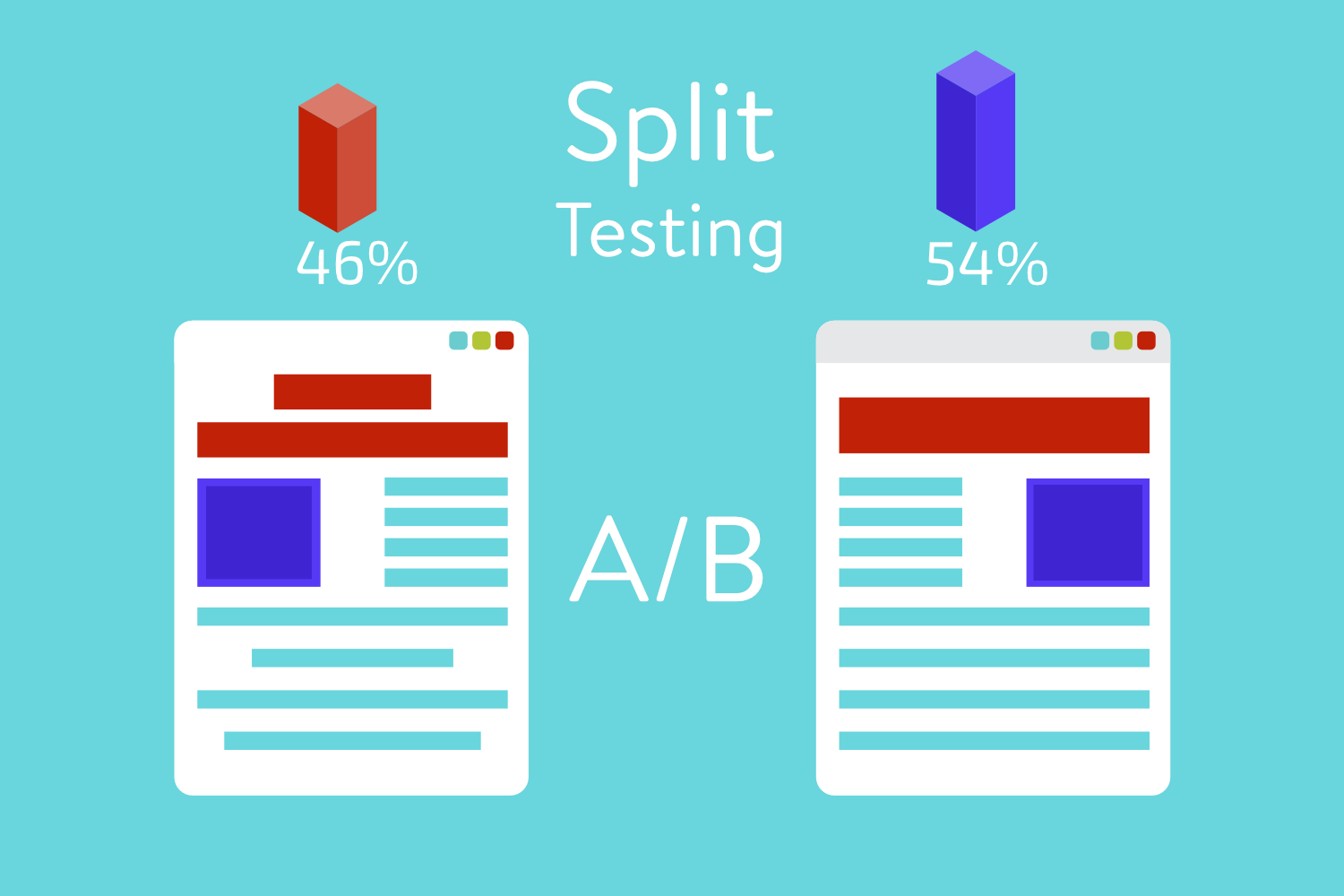
When it comes to conversions, publishers are always searching for the best options. It might be a different button, a different design, a different message, they’re always testing. When they find two or more options that might convert, normally they prefer to do an A/B testing method to see which one their audience likes the most and converts better.
What is A/B testing?
A/B testing is a process where you show two different designs on the same web page. Only segmenting different visitors to your website you can see which one converts better.
Sounds easy right? While it might sound really easy, there are a couple of rules you need to follow so that your tests don’t come out as a failure!
These are the 5 steps that you need to follow for your a/b test to be successful:
1.That the GEO in consideration
If we can agree that all countries work differently, then why use the same exact a/b testing strategy that the foreigners use?
Different countries have different religions, different cultures, and different morals. What can be wildly acceptable in one country can be extremely offensive in the other.
If you want to do an effective a/b test you should do quick research! You should know what is acceptable or unacceptable in the country that you want to target.
2. Use a Heatmap tool
Analyzing your a/b test without any professional tools is like building a car with no wheels. It simply doesn’t work.
Analyzing only conversion rates and clicks leads you nowhere. It only leaves you with no conclusions about what you need to improve or what you need to continue doing. On the other hand, a heatmap tool is one of the best ways to know where your users click the most. This leads you to assertive conclusions about what converts best.
The best tools to heatmap your A/B test are:
3. Avoid A/B testing blindly
Avoid falling on the mistake of running two similar pages when you a/b test. If the pages look similar, the results will probably be similar as well. That is basically throwing away time and resources, you will leave the test with pretty much no answers.

For example: One of your approaches converts better. But another designs gets more clicks. In this way, you will only gain when fusing the better approach with a better design. That’s why you should always go for different pages when you do the test.
4. Don’t overload your pages
It might seem obvious but many publishers still do this mistake. Incorporating every idea that you have on your a/b test will not only frustrate the user, it will also ruin the purpose of the test.
Studies have shown that an overloaded page can lead the users to – disappointment, irritation, and deterrence. So the best option here is choosing a good design. Where you can incorporate your ideas in a natural form. In this way, it doesn’t seem that you are putting unnecessary things on your page.
5. A/B test your ads
If you a/b test your page you should do the same with your ads. Not all ads will convert, not all ads will fit your website, it’s all about trying and see what fits.
You should take a careful look at your ads. Change the CPC where is needed and remove the units who show you no results. See what your audience prefers and chose your ads in that direction.
Best tools for a/b testing
What is the point of you knowing all this if you don’t know which tools you need to use for a/b test right? For a/b test to be the most effective we recommend you to use:
· VWO
Conclusion
If you made it this far we will tell you the main things that you should test. These are:
· Headlines
· Design used for conversions
· Sales copy
· Product descriptions
· CTA
Fuse this with the other 5 tips and the tools that we recommended. We are certainly that’s your a/b test will be very successful and conclusive!


