Have you ever wondered what drives your users to prefer one image over another? Or why did they click that specific creative and not the one that seemed to you the best of all?
Sometimes, the best marketing moves are those rooted deep within human psychology. The greatest marketers are those who have the most in-depth knowledge of how the brain works.
One of the key features of the human brain involves urgency.
In this article, we will explain how some psychological “shortcuts” can help the user take specific actions – the actions you want him to perform. And how you can remarkably increase your conversions.
How to capture users’ attention with psychology?
Certain types of images or particular phrases used in creatives are known to have a specific effect on the user’s psyche.
We will call them “attention grabbers,” they exploit heuristics and the principle and operant conditioning, according to which the human brain is led to associate a reaction to a given stimulus.
Attention grabbers hinge on some of the most substantial and most primitive feelings of the human being:
- anger and fear
- sadness and joy
- surprise
- disgust
Smart affiliates take advantage of these kinds of emotions to capture users’ attention because they are most likely to trigger biases.
How? For example, by taking one of these feelings to the extreme, as in the case of “scary” ads:

Some attention grabbers are also called “scroll blockers”, and are particularly suitable for advertising on social platforms (but also native, display, or push) where the main action of the user is precisely to scroll.
Scroll blockers are usually arrows, circles, or frames that highlight entirely or a specific detail in the image, a in the image below:

Another type of attention grabber is numbers. The human mind is attracted to odd numbers more than even ones. It is good to take this detail into account when writing a landing page and images & texts of this type!
How to make users click on your ads?
#1: Loss aversion
Loss aversion is a cognitive bias that causes us to fear loss more than we value gaining something of the same value. We’re quite literally more frustrated to lose €10 than we are happy to find one in the pockets of an old pair of jeans.
Coupons are a classic loss aversion tactic that has boomed an entire sub-industry of eCommerce.

How it makes people click?
One of the reasons coupons are more effective than regular sales is because brands are giving consumers something imaginary – a coupon they feel as if they own. And, the fear of missing out on this discount is greater than the sense of gain they’ll get from a regular discount of the same value.
Another way brands exploit loss aversion is by placing time limits on special deals. This creates a sense of urgency because users feel like they’re going to lose out on the opportunity of getting a special deal.
Likewise, you can also create a sense of urgency by using scarcity to trigger loss aversion.
#2: Anchoring
Anchoring is another bias where people assign more significance to the first piece of information they receive. For example, the first review someone reads about a product, service, or brand will have more of an impact on them than the second or third.
How it makes people click?
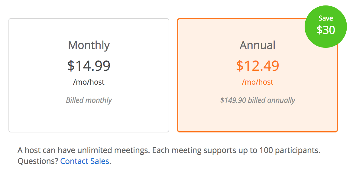
The most common use of anchoring you’ll probably come across is manipulating people’s perception of prices. Essentially, if you start with a more expensive price and then follow with something cheaper, the second price instantly feels like a good deal.
This is because the first price set the bar of price expectation and anything lower than that will undercut this new-found perception of a default price.

Software companies often use this tactic by leading with a more expensive plan and then following up with a cheaper option. Instantly, those cheaper plans seem reasonably priced and the sense of this increases with larger price differences.
#3: Reciprocity
When someone does something for you, reciprocity describes the compulsion you have to do something for them in return. Or, when someone receives something for free, they then feel compelled to give something back in return.

How it makes people click?
This tactic has been used by brands for decades. One of the most common pre-digital examples was companies giving out free samples.
We see reciprocity everywhere in modern marketing with free content, downloads, trials, gifts, free anything.
There are two key principles you need to understand to make reciprocity work, though:
Give first: To trigger reciprocity, you have to be the first one to give. Offer something to prospects without any obvious reward.
Value: You have to offer something of perceived value and the greater this perception of value is – the greater the more prospects feel obliged to repay.
Offering discounts on items or adding free gifts to purchases doesn’t trigger reciprocity. Why? Because it requires the customer to give first. People need to feel like they’re getting something of value for free without any obligation to do anything in return.
Psychology will take care of the rest and naturally compel these people to repay something of a similar perceived value.
What comes before the CTA is just as important.
In this article, we’ve looked at 3 genuine psychological factors that influence how people perceive information and make decisions. We haven’t looked at CTA button colors or discussed sans vs sans-serif fonts because those are minimal influencers when it comes to inspiring action.
The most important takeaway from this article should be that the content that comes before the CTA is just as important as anything else. It’s how you set users up with ad copy, page content, layouts, and emotional triggers that will determine what they do when they arrive at your CTAs.
So don’t just focus on how your CTAs look; optimize the path to finding them and make the most of the psychological tools at your disposal to influence people’s mindsets before they reach your calls to action.
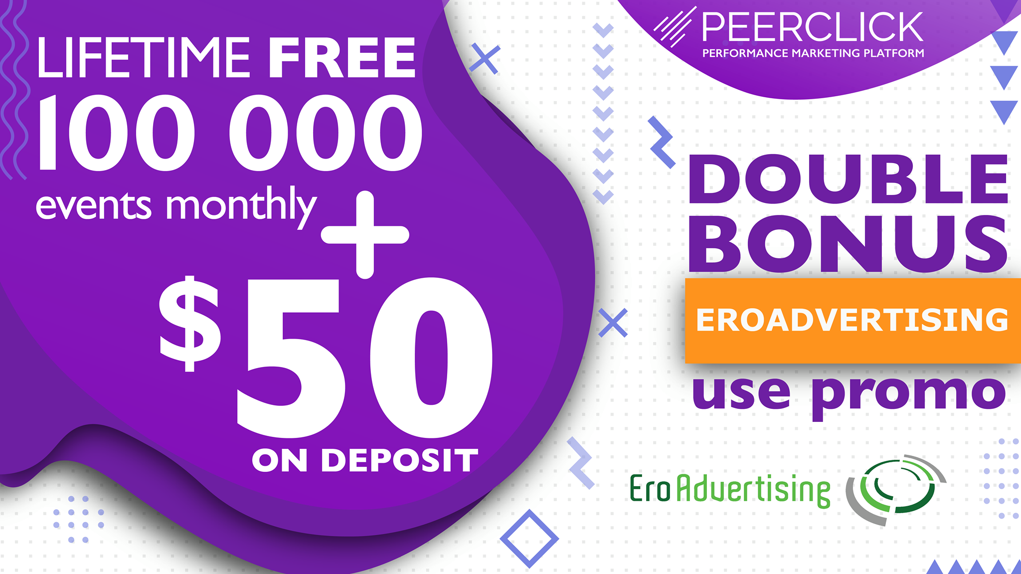
Do you need an ad network that allows you to work with the best publishers and advertisers?
Join us on this journey to success and accomplish incredible results.


